Dashboard UI Improvements
This morning, we've released a few small tweaks to our dashboard to improve the user experience. We recommend taking a quick look so you know what changes to expect to our navigation menu and configuration editors.
Navigation Menu
The first thing you may notice is the darker theme on our nav menu, and the addition of icons to differentiate each option.

We have also reordered a few links to be more intuitive. Here's a quick summary of where to find what you're looking for:
- If you have access to multiple dashboards, the dashboard selector is at the top of the menu.
- The Test Mode toggle (and Test IDs) is just below.
- Logs are moving from the Team section to the Transactions section.
- The Integration section is now separated into General and Third-Party Integrations pages.

Template Editor
You can now create a new Action Map or Theme to associate with your Template from directly within the Template editor.
Simply click the currently selected name, and select "Create Action Map" or "Create Theme" from the dropdown. When you're finished configuring the Theme or Action Map, you can easily pick up where you left off by returning to the Template.

Action Map Editor
We received feedback that it was difficult to remove items from the Action Map. We agreed! Now you'll see a "delete" icon to the right of each condition statement so you always know which item you are removing.
Theme Editor
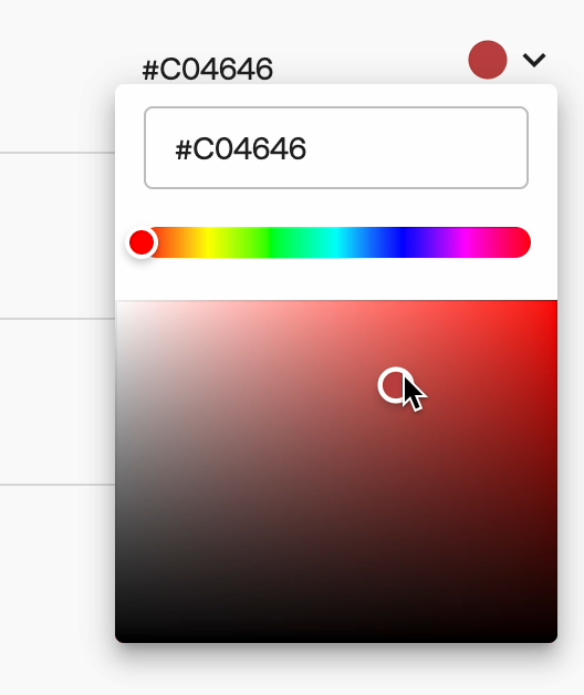
We're adding a color preview and color picker to the theme editor to make it easier to customize the look and feel of your customers' verification flow.
When editing a theme, you can still add the hex code directly, but now you may also tap the arrow to the right to open the color picker. Use the slider or drag your cursor across the picker to view and select the right color. No matter which method you use, the color will be previewed directly in the editor.

If you have questions about these or any other updates, please reach out to us by email or in your designated Slack channel.
